Case Study —01 / 05
Banking Experience
Visuals are illustrative recreations — details generalized under NDA
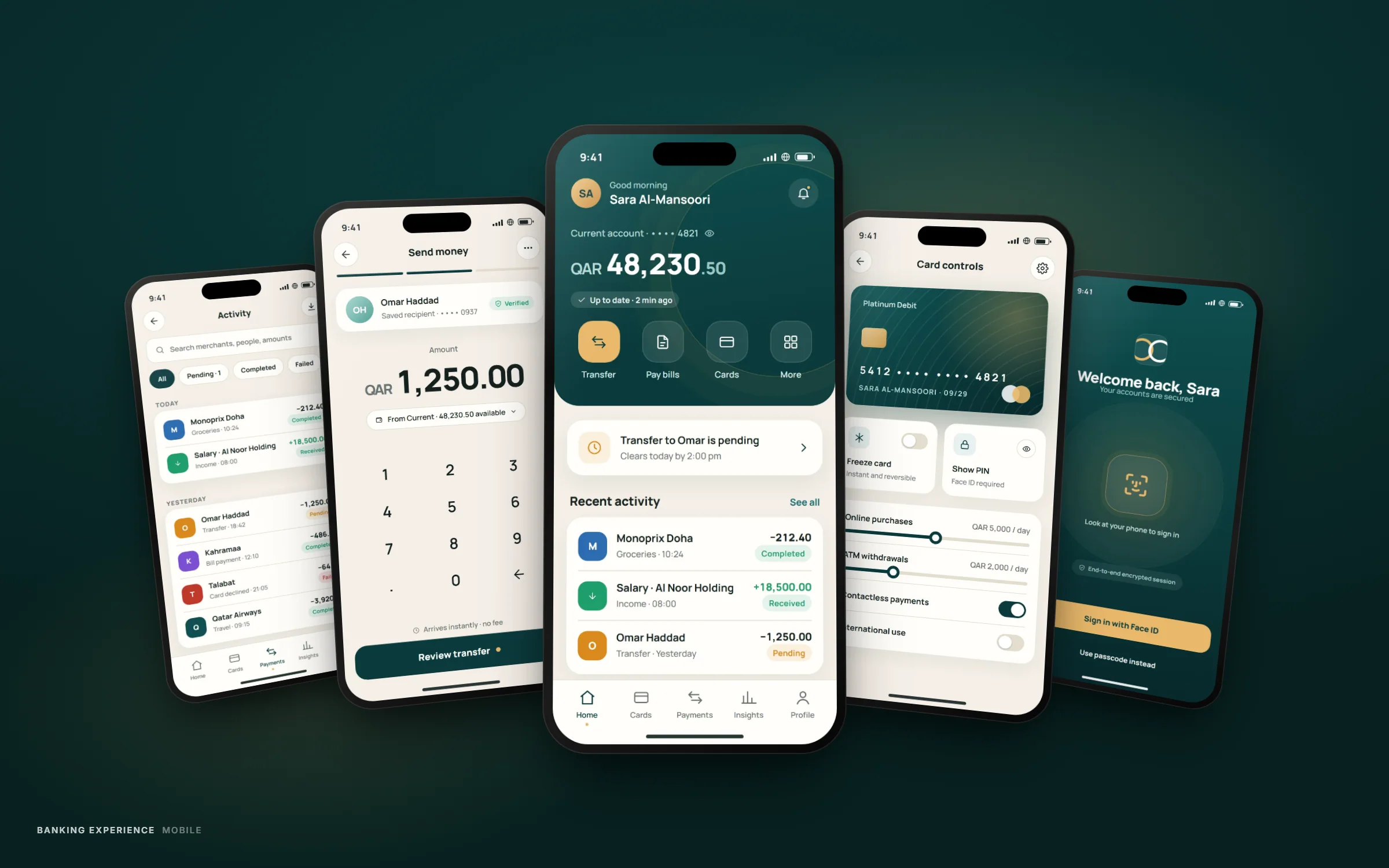
Overview
Product
Retail mobile banking app
Client
Confidential fintech client
Role
UI/UX Designer — end-to-end product design
Timeline
6 months, Jan – Jun 2026
Responsibilities
Research & discovery, Information architecture, Interaction & UI design, Design system contribution, Usability testing
Problem
Everyday banking felt like a chore, not a tool people trusted
Customers were completing core tasks — checking a balance, sending money, freezing a card — but taking far more steps than the task required. Support tickets kept surfacing the same friction points: unclear statuses, buried settings, and a card-controls flow that assumed more banking literacy than most customers had.
The bank needed an app that felt as considered as its branch experience, without asking the design team to reinvent trust from scratch — trust here is inherited from the institution, and the interface's job is to not spend it.
Challenge
Simplicity and compliance pull in opposite directions
Every screen in a banking app carries regulatory and security requirements that a purely minimal interface would happily discard: consent screens, transaction confirmations, fraud prompts. The challenge was designing an experience that reads as simple while carrying all of that necessary weight — without the interface feeling like it's protecting itself instead of the customer.
A second constraint: the app runs on a shared component library used across the bank's other digital products, so new patterns had to be justified, documented and contributed back rather than designed in isolation.
Approach
Research
Contextual interviews with retail customers across age and banking-literacy segments, plus a teardown of the existing app's support-ticket themes to locate where confusion clustered.
User flows
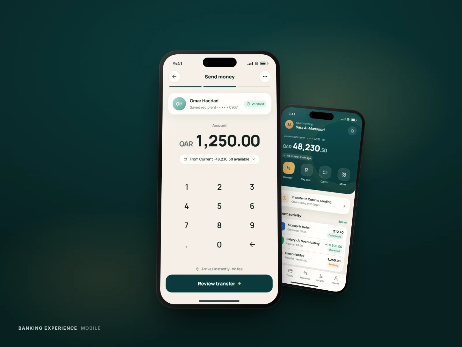
Re-mapped the five highest-frequency journeys — onboarding, transfers, card controls, statements, support — to cut redundant confirmation steps without removing anything compliance required.
Wireframes
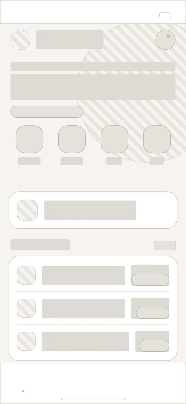
Low-fidelity flows tested with five customers per round, iterating on where status and balance information needed to live for it to be trusted at a glance.
UI design
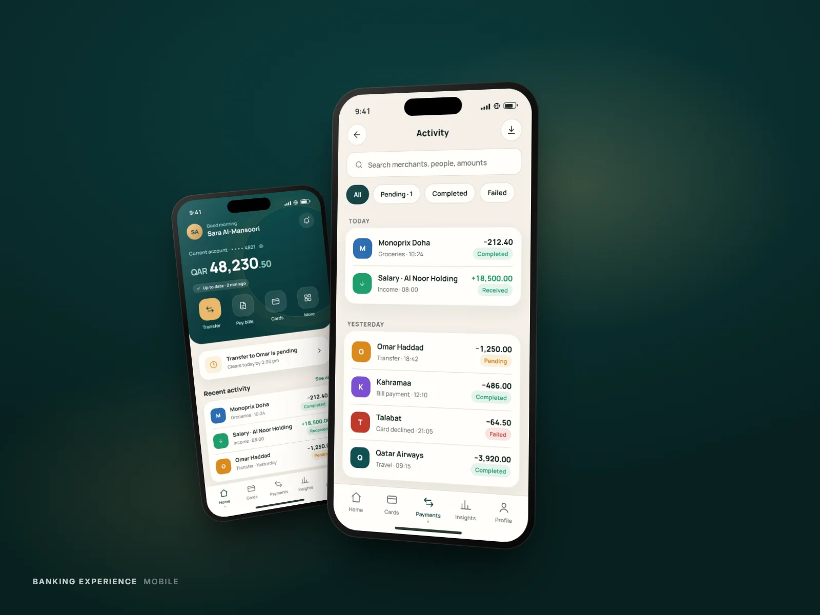
Applied the bank's visual language with a tightened type scale and a single consistent status-color system, so a transaction's state is legible without reading its label.
Prototype & testing
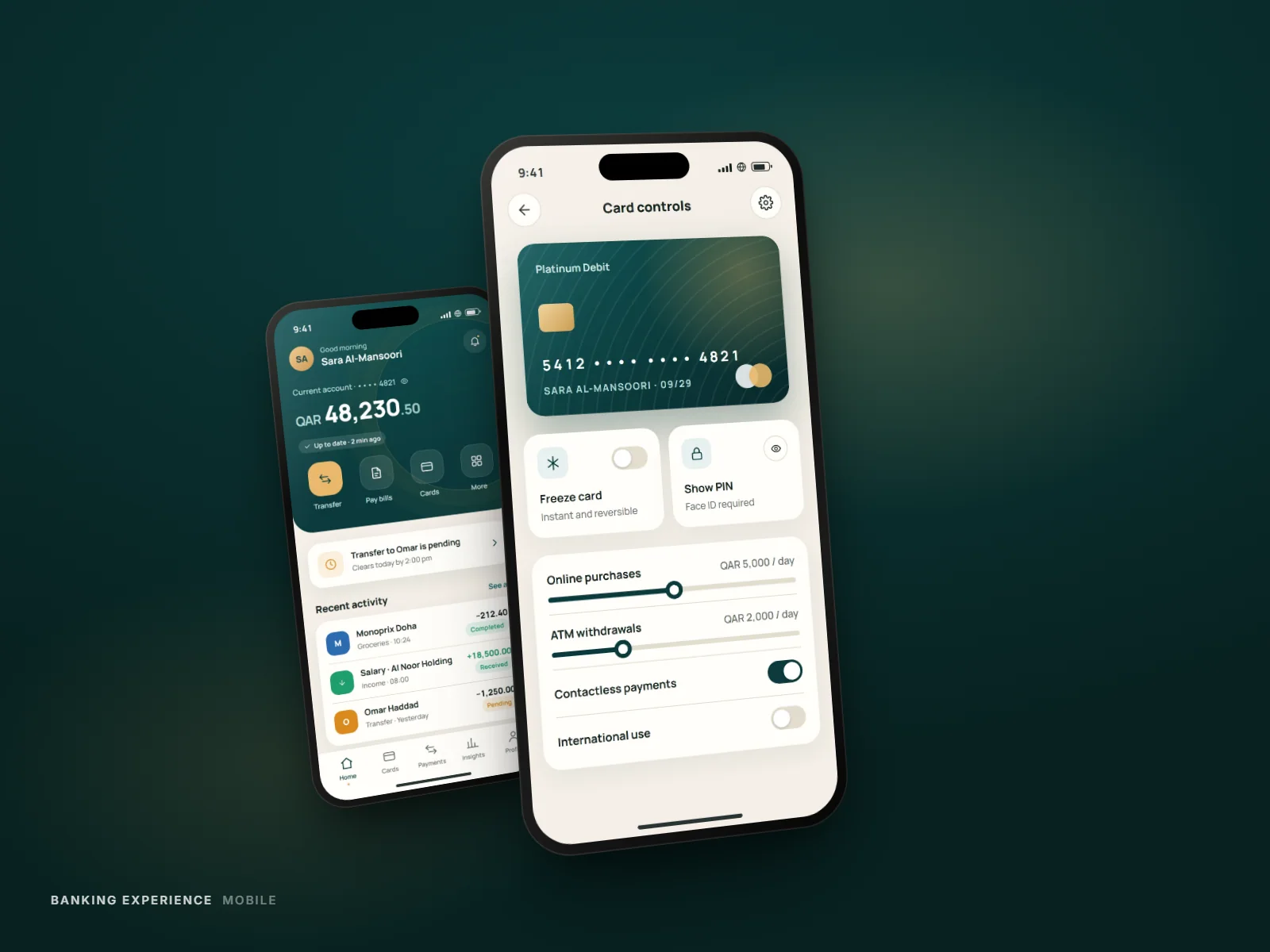
A high-fidelity interactive prototype run through two rounds of moderated usability testing, refining the card-freeze flow after it was the single most-abandoned task.
Anatomy
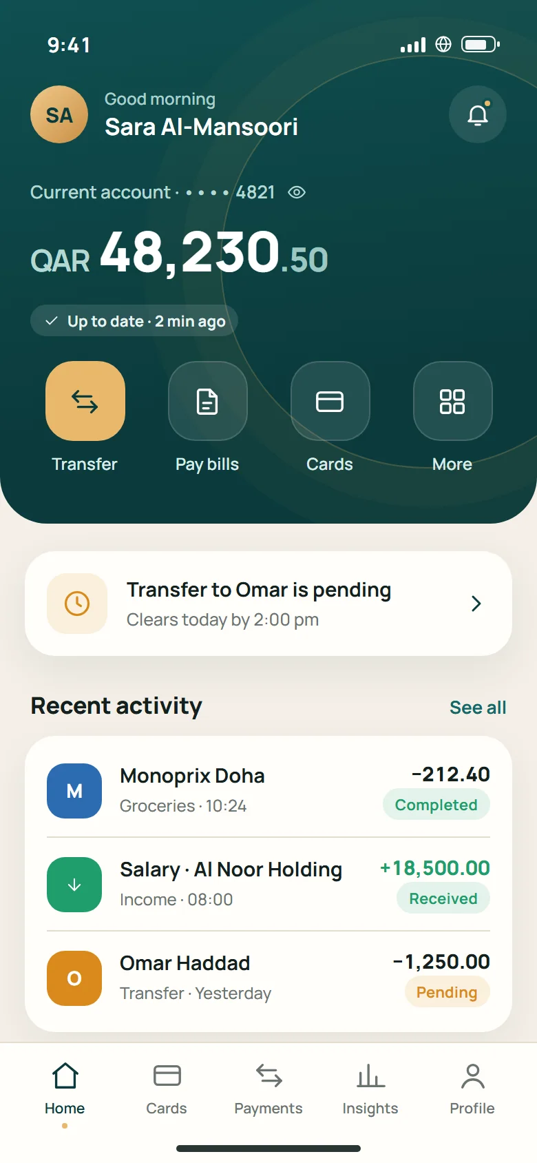
Six layers, one hierarchy: status first, everything else in service of it
Scroll to take the screen apart ↓
- 01Surface
- 02Imagery
- 03Cards & containers
- 04Typography
- 05Controls
- 06Navigation
- 01Surface
- 02Imagery
- 03Cards & containers
- 04Typography
- 05Controls
- 06Navigation
Process
Research
Interviews and a support-ticket teardown clustered confusion around statuses, buried settings and card controls.
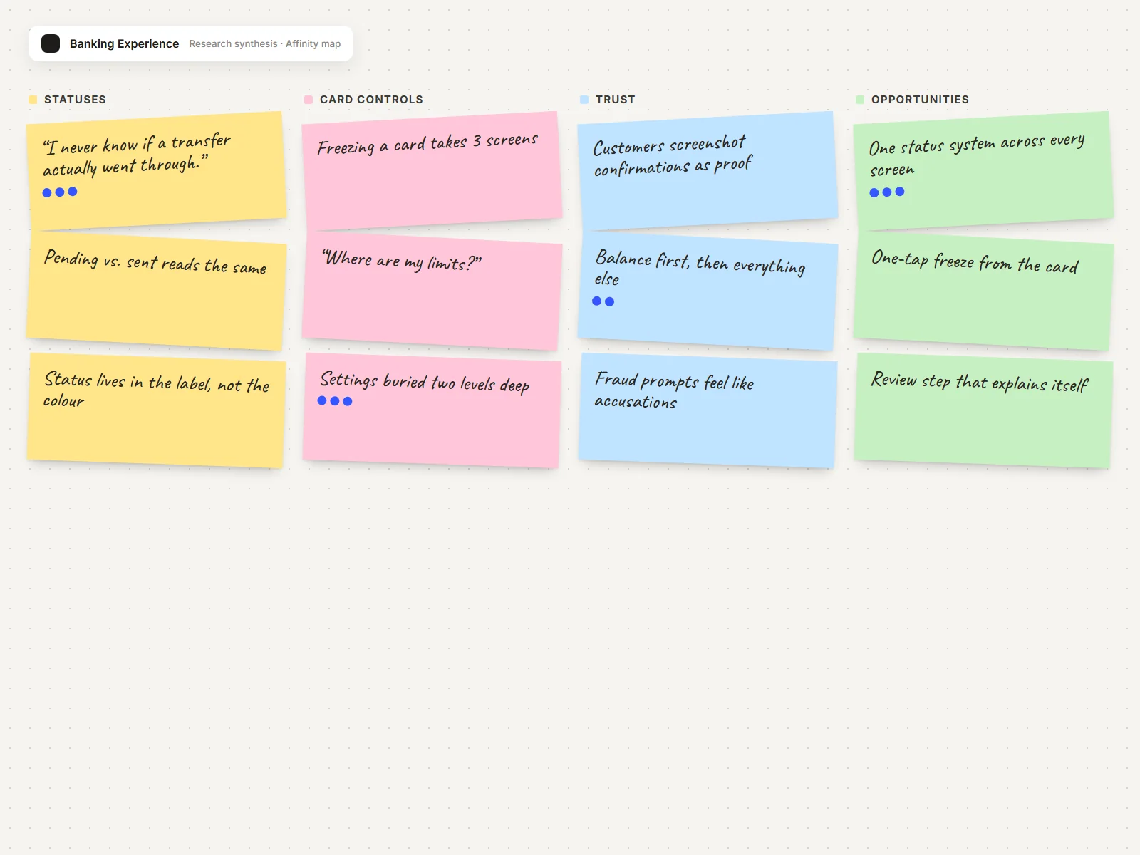
01
Research
Interviews and a support-ticket teardown clustered confusion around statuses, buried settings and card controls.
02
Wireframe
Low-fidelity flows tested in rounds, moving status and balance until they could be trusted at a glance.
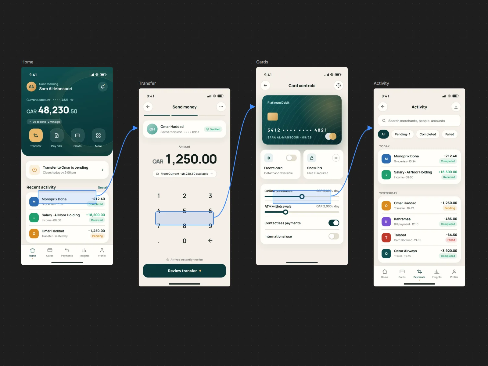
03
Prototype
The five highest-frequency journeys re-mapped end to end, cutting redundant confirmations compliance didn't require.
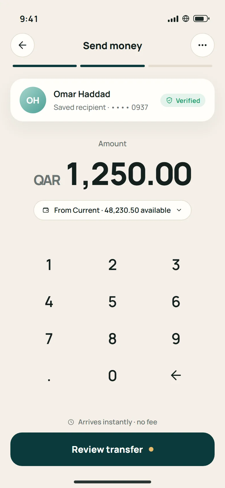
04
UI
The bank's visual language with a tightened type scale and one consistent status-colour system.
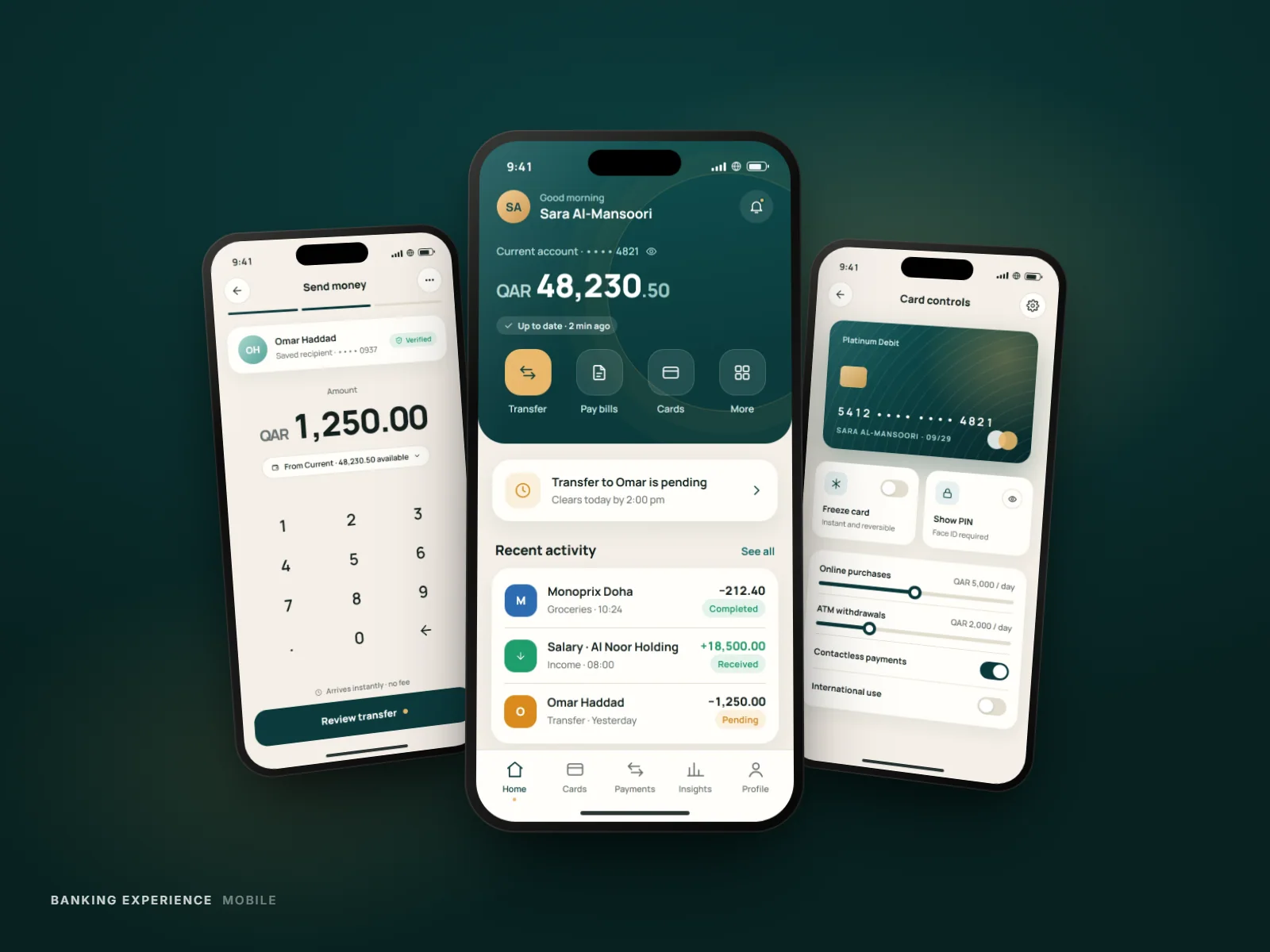
05
Final
A calmer app where the next action is always obvious and every state explains itself.
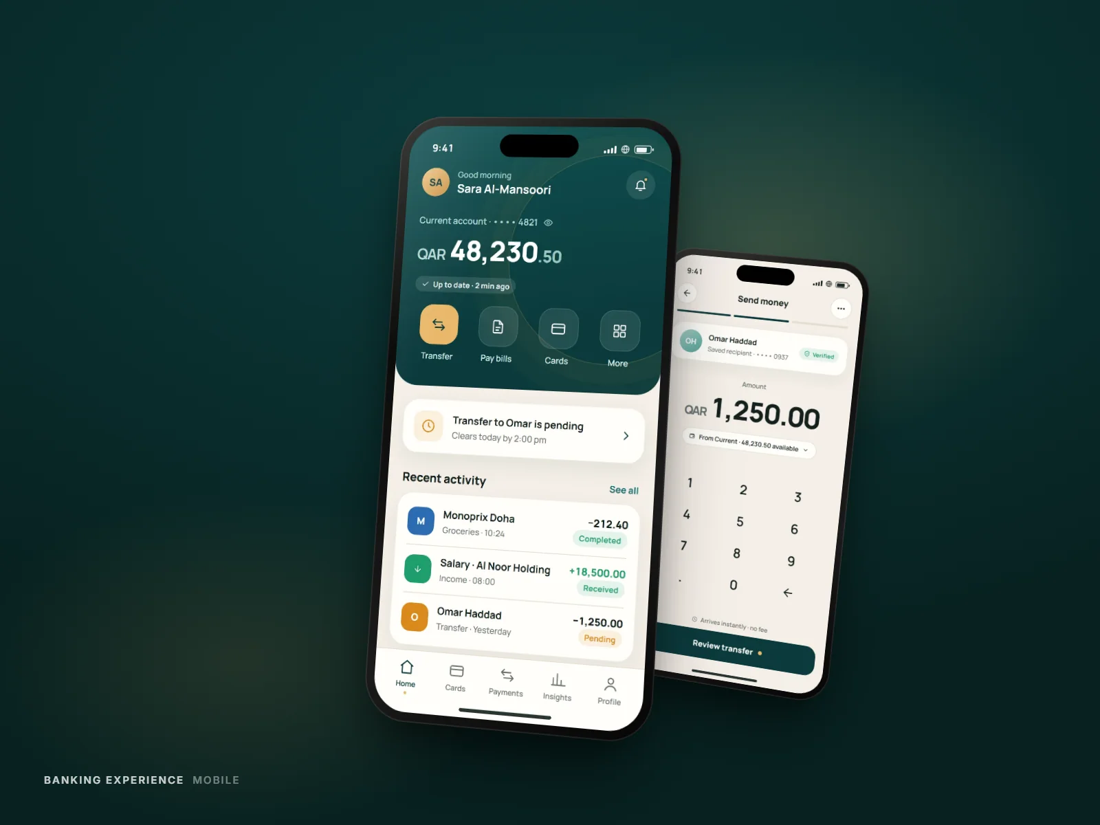
The account overview now leads with status, not just balance.
Gallery
Card controls screen with freeze and spending-limit toggles
Results
Fewer steps
To freeze a card, versus the previous flow
One system
Of status colours shared across every screen
Clearer states
Every transaction explains where it is and what's next
Outcomes are described qualitatively — production metrics are confidential.
Next Project